Logo design for Hilton Heritage & Conservation, an architect firm in Leeds, West Yorkshire. I presented the client with a number of concept designs before arriving at the final design on the far right. I went onto create stationary and business cards for the firm as well.
Weekly Vimeo Videos 01
Hey up folks and welcome to the 1st Weekly Vimeo Videos post. I will be posting a variety of videos that are amazing for a number of different reasons. Click thumbnails to view videos.
I Miss Drugs – A web series that takes a quirky look at a trendy couple obsessed with all things material. A great combination of storytelling, acting and music.
Dishonored – Another series, this time animated. Inspired by the game of the same name, produced by ROKKAN / Psyop that looks at the steampunk-inspired whaling city of Dunwall.
Monsieur Flap – A naughty short with Mr Flap and family, will they accept their differences?
Drive By Shooting – A light-hearted but informative film by Vimeo staff members that gives some great advice on achieving loads of awesome shots whilst using a car.
The Lion City – A time-lapse that stands out from the crowd. Excellent cinematography combined with flawless post production that transports the viewer to a smaller scale.
YA-NE-SEN – Effortless rotoscoping partnered with a combination of watercolour and crayon work. A delightful animation full of life, dancing and great music.
Anjaly Friend’s Page
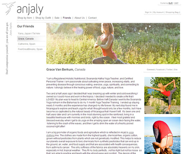
Web page design I did for Anjaly, a yoga clothing company. The brief was to create a Friend’s Page so they could showcase the different Yoga teachers they support around the world.
The site design already existed so I had to ensure my page design fit seamlessly with the rest of the site. I also had to take into consideration that the Friend’s Page would grow in size over time, the design had to be flexible to allow for this growth.
Visit the Friend’s Page.
Isobel Poster Design
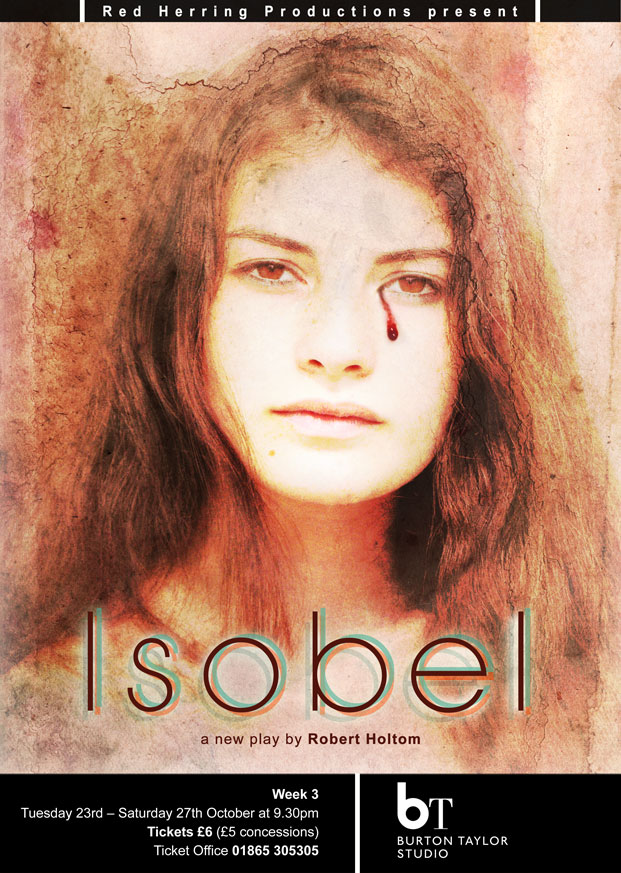
A poster design for my brother’s new play, Isobel, a darkly humorous satire set amongst the scheming spires of Oxford University. The play revolves around Jack and Cordelia who share a severe dislike for their fellow student Isobel.
The poster design has a vintage feel that reflects the sadness of Isobel as a student. The design also has a ghostly presence creating intrigue and mystery.
I overexposed the girl, overlayed paper textures, placed the tear of blood and added a few other bells and whistles. I chose the Avant Garde XLight font for it’s simple elegance giving it more weight by creating additional coloured glows beneath. I finished the poster design with black bars, framing the image whilst providing additional information on the play.
Visit the Oxford Playhouse to find out more and book tickets.


